Histograms, Frequency Polygons and Ogives Return to Lessons
In each case the idea is to give a pictorial representation of the data.
Histograms
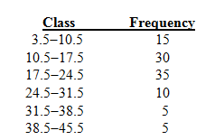
You start with a frequency distribution given with class boundaries. For example

You mark the class boundaries on a horizontal axis, being careful to make the class widths look the same.
You mark a vertical scale starting at 0 for the frequencies and then draw bars above the classes with heights equal to the frequencies.
The horizontal scale can be placed anywhere you like.
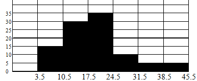 Why does the vertical scale start at zero?
At this point look on page 100 - 101 of the textbook and see what you can say about the shape of the data.
Frequency Polygons
When drawing frequency polygons you use class midpoints. The midpoint is
Class limits Mid point Frequency
4-10 7 15
11-17 14 30
18-24 21 35
25-31 28 10
32-38 35 5
39-45 42 5 Note the difference between successive midpoints is the class width.
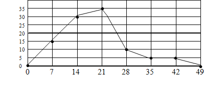
You mark class midpoints on a horizontal axis put dots above the midpoints with heights equal to the frequencies.
You also put points on the horizontal axis one class width less than the lowest boundary and one class width right of the highest boundary.
It is important that you show the scales on the axes.
Ogives (Pronounced O-jives in the USA)
You mark class boundaries on a horizontal axis. The idea of an ogive is to show how many data are less than a given value
Above each class boundary you plot the number of values (data) less than the class boundary.
Class boundaries Frequency Cumulative Frequency
3.5-10.5 15 15
10.5-17.5 30 45
17.5-24.5 35 80
24.5-31.5 10 90
31.5-38.5 5 95
38.5-45.5 5 100
There are no values less than 3.5, so plot zero above 3.5.
There are fifteen values less than 10.5, so plot 15 above 10.5, and so on.
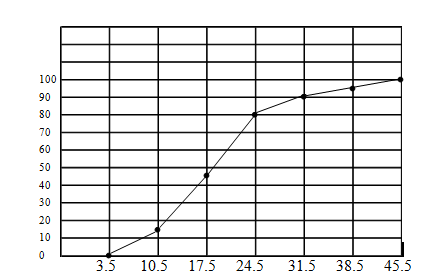
Using Relative Frequencies
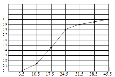
You can construct any of the above graphs using relative frequencies. The pictures appear the same, but the vertical scales are different. For example the above ogive using relative frequencies would be
